

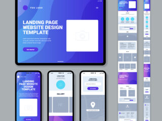
With mobile browsing surpassing desktop use, having a responsive website is no longer optional—it’s a necessity. Responsive design ensures that your site looks great and functions smoothly on any device, from smartphones to tablets and desktops.
Mobile-First Approach
Adopting a mobile-first approach during development ensures that your site is optimized from the ground up. This means designing for smaller screens first and gradually enhancing the experience for larger devices. This approach leads to better performance and accessibility.
User Experience and Navigation
A mobile-friendly website improves user experience and lowers bounce rates, which directly impacts your SEO ranking. Don’t let outdated design drive potential customers away—embrace responsiveness and reach a broader audience.
Testing and Optimization Techniques
Test your website on multiple devices to ensure flawless performance everywhere. Use browser developer tools to simulate various screen sizes and detect potential issues early.
💡 Pro Tip: Responsive websites rank higher on Google, giving you an edge over non-optimized competitors.

Leave a Reply